Dynamic Theme
A new addition in rofi 1.7.5 that did not get a lot of attention is support for the enabled keyword in the media statement and supporting environment values. Or more practical, you can modify your theme based on environment variables.
@media ( enabled: env(DO_X, false)) {
  listview {
    orientation: vertical;
  }
}
You can now enable this part of the theme by running rofi with DO_X set.
DO_X=true rofi -show combi
Image browser example
In the current release, there is a fullscreen_preview as an example.
In this theme we are going to modify the filebrowser view with a preview widget that we can enable.
Lets start with the basic theme.
* {
    background-color: transparent;
    text-color:       white;
}

window {
    fullscreen:       true;
    background-color: black/80%;
    padding:          4em;
    children:         [ wrap, listview-split];
    spacing:          1em;
}


/** We add an extra child to this if PREVIEW=true */
listview-split {
  orientation: horizontal;
  spacing: 0.4em;
  children: [listview];
}

wrap {
    expand: false;
    orientation: vertical;
    children: [ inputbar, message ];
    background-image: linear-gradient(white/5%, white/40%);
    border-color: lightblue;
    border: 3px;
    border-radius: 0.4em;
}

icon-ib {
    expand: false;
    filename: "system-search";
    vertical-align: 0.5;
    horizontal-align: 0.5;
    size: 1em;
}
inputbar {
    spacing: 0.4em;
    padding: 0.4em;
    children: [ icon-ib, entry ];
}
entry {
    placeholder: "Search";
    placeholder-color: grey;
}
message {
    background-color: red/20%;
    border-color: lightsalmon;
    border: 3px 0px 0px 0px;
    padding: 0.4em;
    spacing: 0.4em;
}

listview {
    flow: horizontal;
    fixed-columns: true;
    columns: 7;
    lines: 5;
    spacing: 1.0em;
}

element {
    orientation: vertical;
    padding: 0.1em;

    background-image: linear-gradient(white/5%, white/20%);
    border-color: lightblue /15%;
    border: 3px;
    border-radius: 0.4em;

  children: [element-icon, element-text ];
}
element-icon {
    size: calc(((100% - 8em) / 7 ));
    horizontal-align: 0.5;
    vertical-align: 0.5;
}
element-text {
    horizontal-align: 0.5;
    vertical-align: 0.5;
  padding: 0.2em;
}

element selected {
    background-image: linear-gradient(white/25%, white/10%);
    border-color: lightblue;
    border: 3px;
    border-radius: 0.4em;
}
When running this theme:
rofi -theme fullscreen-preview.rasi -show filebrowser
We already prepared the place where we are going to add a 2nd widget. Now lets, at the end of the theme, add the extra element in a media block.
@media ( enabled: env(PREVIEW, false)) {
The variable is PREVIEW, if it is not set false is used.
Otherwise the content of PREVIEW is parsed.
These will be merged into the theme on load:
/**
 * Launching rofi with environment PREVIEW set to true
 * will split the screen and show a preview widget.
 */
@media ( enabled: env(PREVIEW, false)) {
  // preview widget
  icon-current-entry {
    expand:          true;
    size:            80%;
  }
  // override the children of `listview-split`
  listview-split {
    children: [listview, icon-current-entry];
  }
  // Reduce to 4 columns
  listview {
    columns: 4;
  }

}
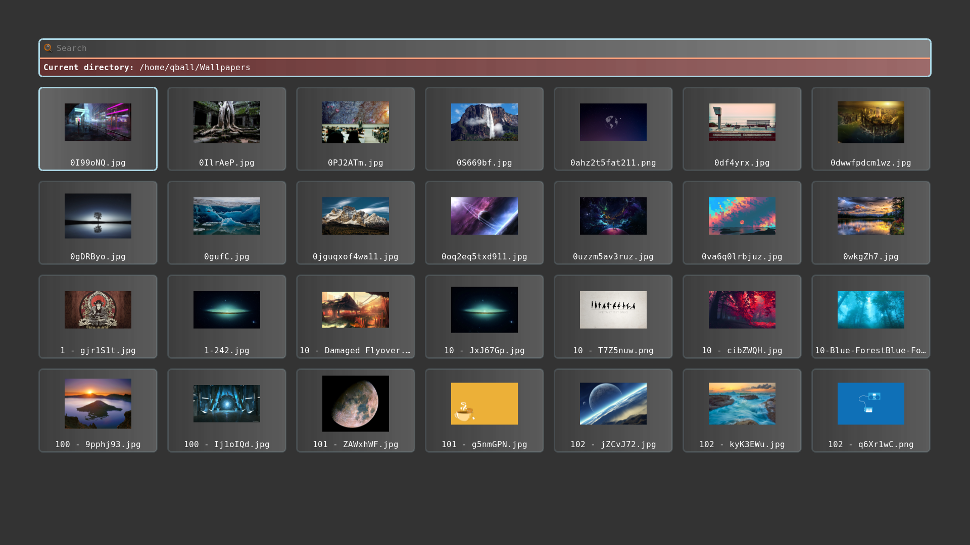
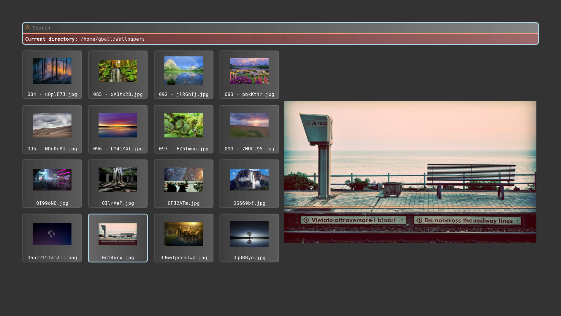
Now if we run it:
PREVIEW=true rofi -theme fullscreen-preview.rasi -show filebrowser
It looks like this:
We can add more sections; for example for text only we hide the images:
@media ( enabled: env(NO_IMAGE, false)) {
    listview {
        columns: 1;
        spacing: 0.4em;
    }
    element {
        children: [ element-text ];
    }
    element-text {
        horizontal-align: 0.0;
    }
}
Wallpaper picker
If you run latest git version, you can now easily make a wallpaper picker:
PREVIEW=true rofi -theme fullscreen-preview.rasi -show filebrowser -filebrowser-command 'feh --bg-scale' -filebrowser-directory ~/Wallpapers/